Some people swear that the new Windows 10 is the best Microsoft have to offer which might be true but people are still very skeptical about it and having their design come in with such a boring design is not going to help either.
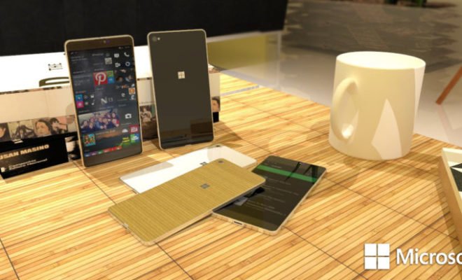
Besides being criticized for the lack of apps, the Microsoft Lumia 950 was often criticized for having one of the worst premium design. Maybe if Microsoft gave it a design like the device in the image, things would have gone a little different.
The device seen in the image is just a concept designed called Microsoft Lumia 760 by artist Lucas Silva. While we are not too sure about the whole organic casing, we think that he is definitely on the right path. If Microsoft wants to compete with Android and iOS they will have to come out with something that will grab our attention and fit it with a design like that should help.
Do you think the Microsoft Lumia 950 would have performed better if it was fitted with a better-looking design?


