Microsoft actually did a pretty good job last year. Their Microsoft Lumia 950 was a solid device with a great hardware. The Window 10 OS was a little buggy at first but Microsoft managed to iron out most of the problems with the first few updates.
While most people seems to think that the lack of important apps was the reason why the Microsoft Lumia 950 did not make it, other think that the design of the Microsoft Lumia 950 also played a role.
While we won’t call it an ugly smartphone, it is definitely not the most unique or distinct smartphone in the market. With Microsoft also struggling to get people to notice their smartphone, offering it with such a bland design wasn’t going to help.
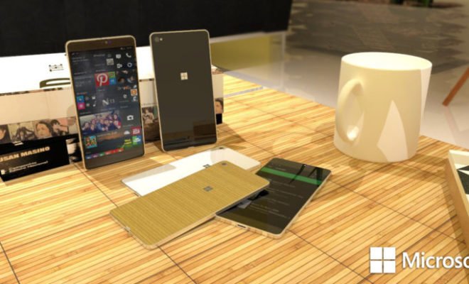
However, we also understand why that design was chosen. Since Microsoft main audiences are the business users, they probably figured that a more subtle and toned down design was the way to go but we think that maybe a design like the one seen above might actually work Microsoft.
What do you think of the Microsoft Lumia 760 Concept design by artist Lucas Silva?


