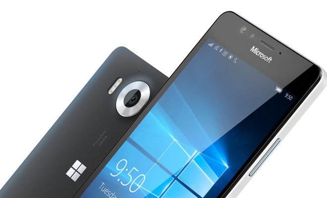
You would think that Microsoft would at least try to look like they were interested in grabbing the attention of their younger consumers by offering the Microsoft Lumia 950 with a more interesting and eye catching design but instead, they decided to go for the boring and bland design that many of us were not too impressed with.
Maybe if Microsoft had gone for something like looked like the concept above, things would have gone a little better for them? The concept on the top is called the Microsoft Lumia 760 concept and it was designed by artist Lucas Silva.
While it might not be the most creative design in the market, we think that it is unique enough to at least grab the attention of the consumers.
Of course, the design was just one of the many reason why people just not that interested in the Windows 10 powered Microsoft Lumia 950.


