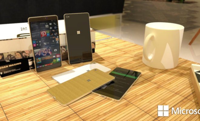
It seems like there are a couple of reasons why the new Microsoft Lumia devices like the 950, 950 XL and the 650 did not make it but one of the main reason was also the ugly exterior design.
It does not look bad but it looks way too boring and matured. Compared to some of the other smartphone in the market like the Samsung devices, the iPhones, and even One Plus, the Microsoft Lumia devices just looked plain boring.
Maybe things could have been a little better if they make the device more appealing to the younger generation. The concept design you see here was design by artist Lucas Silva. The organic cover does help set the device apart from their competitors and it does look young and interesting.
Of course, the looks is not the only thing to blame here. Looking at the Microsoft Lumia devices, it does feel like they are not planning to make the device appealing to the younger generation. From the design to the features and apps, the Lumia devices does feel a little too serious at times. Do you agree?


