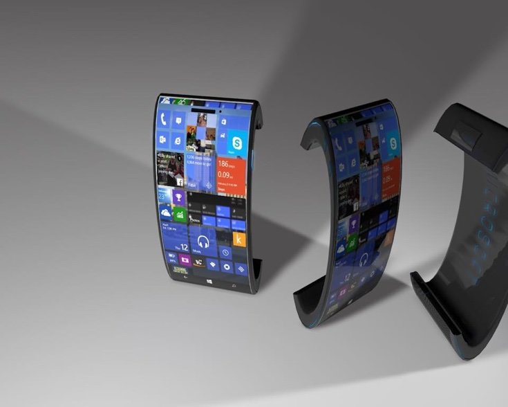
Artists tend to go crazy when it comes to coming out with a new smartphone and smart device concept and while we have seen a few interesting ones, the Microsoft Lumia 888 concept designed by Micheal Muleba might be one of the most impractical design we have seen in a while.
We got to admit that the concept design actually looked good. It looks very futuristic and modern but to the point where we do not know how it would function in real life. To be fair, this is just a concept and we do comment the artist for going out of the box.
The Microsoft Lumia 888 concept was given and outward curved design that looks great but by looking at it, it feels like the device will be very uncomfortable to use. The outward curve does not fit well on your palm. Answering calls would be a nightmare and putting it inside out pocket would be near impossible, not that the flagship phones we have now are any better at fitting inside out pocket.
Check out the rendering and give us your opinion.


